You may have heard by now of a neat little project called The Warmest 100. Online marketer Nick Drewe and some of his friends and workmates used some clever insight, and some simple statistics, to attempt to predict the outcome of this year’s Triple J Hottest 100.
I’m putting together an article for iTnews.com.au which will run after the countdown is finished, but it’s only going to be short. I’ve spent a bit of my spare time on this in the last couple of days, and there’s more to write about than will fit in a short news article. And maybe I can drum up some suspense, who knows?
Nick was also kind enough to share his source data with me, so I’ve had a bit of a play with it.
I won’t provide any spoilers here. If you want to know the predictions, go to The Warmest 100 site and scroll down.
How Accurate Are The Predictions?
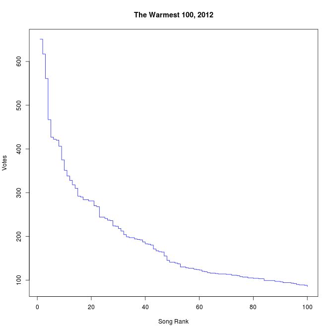
We’ll find out on Saturday, but let’s look at the data and the assumptions in broad terms. Here’s a chart of the songs by rank and the number of votes they got in the sample data:
The data comes from people who shared their votes on Twitter, Facebook, and elsewhere. This is analogous to exit-polls for elections, only it’s more accurate. Why? I’ll explain.
With an exit-poll, people are asked after they’ve voted (as they exit, hence exit-poll) who they voted for. There are no guarantees that they tell the truth. You may not want to tell the pollster that you voted for the Sex Party, or Katter’s Australia Party, or some other fringe weirdos. The companies that conduct these polls know this, and try to allow for it in their statistical models. Most people apparently tell the truth. Enough for exit-polls to be quite accurate in many cases.
However, with the Warmest 100 data, Nick collected that actual vote data. Because of the way Triple J organised things, when you tweeted “Check out what I voted for in @triplej’s #Hottest100 2012” there’s a link to your actual votes. That’s a lot stronger than what you might say to a pollster asking you who you voted for.
Possible Errors
We’ve established that the vote data is accurate, but it may not be representative. That means that the people who shared their votes on Twitter may not represent the views of the wider TripleJ audience.
Imagine that only people aged 50 and over used Twitter. That would mean that only those over 50 shared their votes. The over-50s listening audience of TripleJ, a youth station, is probably pretty small, so we may have collected information on what they like, but not what everyone else under 50 voted for.
That’s a risk, and we don’t know if the data is representative or not. But to me, it doesn’t seem to be a big stretch that the Twitter audience is probably pretty similar to, or at least representative of, the wider TripleJ audience’s taste. Again, we get to find out on Saturday how true this assertion is. And that’ll be quite neat all by itself.
Verification
Based on the description of Nick’s method, both from chatting to him and from reading about it, I re-implemented it myself last night.
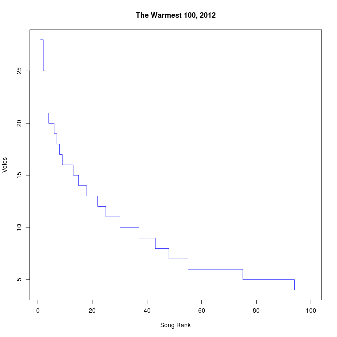
I was hampered by the fact that Twitter only lets you get at about 4-5 days of search history, so because the voting closed on Sunday, most of the tweets were too old for me to pick up. I did managed to get a sample size of 1590, though (159 people’s votes). And here’s the chart:
It’s not as good as the Warmest data, because it’s all late voting and I have less confidence that it’s fully representative, but my sample data agrees with the Warmest sample about the winning song. Interestingly, my data has the Warmest 2nd place winner ranked down at 14, but my number 2 is the Warmest number 3. Maybe there wasn’t much late voting for the Warmest number 2 song?
Good News
By collecting a lot of data, The Warmest 100 becomes a sample of the actual votes. 35,080 votes to be exact. There were apparently 1.26 million votes in the Hottest 100 last year, so if the same number of people vote, it’s a sample size of about 2.78% of the total votes. If there are 1.4 million votes, it’s 2.5%.
This is quite a lot of data, because of the way statistics works. I won’t go into it in enormous detail, but let’s just say that the more data, the better, but you only need a surprisingly small number of samples to get pretty confident about the predictions you can make.
Check out this page from the Associated Press that explains exit polls in more detail, and shows how quickly your sample error drops with more people surveyed.
Again, no spoilers, but the large number of samples means that there’s only about an 8.9% chance that the number 1 ranked song got less votes than number 2, and about a 1.1% chance that number 2 got less votes than number 3. Numbers 6, 7, and 8 are much closer together in the sample, so they may well change places in the actual tally.
My sample data is much more error prone. It’s 30% likely to be wrong about number 1, 21% about number 2 and 41% about number 3. It gets worse from there, so clearly 1590 votes isn’t enough data to make any kind of prediction with any confidence.
These percentages aren’t completely accurate, but it’s a good enough go for 10:30pm when I can’t be bothered figuring out how to get R to find the intersection point of two normal curves.
Happy Listening
Anyway, I’ve now got an extra reason to listen to our nation’s premier music countdown.
I’ll tell you more about the data collection method Warmest used in my iTnews piece, and more about mine in a blog post later.
For now, let’s wait and see who the real winners are on Saturday.


